Blog>Trade>Starting a Business>What makes a good logo?
Last updated: 18 April 2024

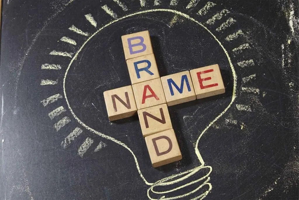
What makes a good logo?
Your favourite clothing. Preferred foods. Makes of car, furniture, technology. A company identity is an essential part of building brand awareness and growing your customer base. So, what makes a good logo? Let’s take a closer look.

Essential elements of logo design
Designing a company visual identity is an essential part of building your brand. Your logo should be immediately recognisable so that consumers know straight away who they are working with. Over time, it'll come to represent your business, with this in mind, it needs to be something that you are happy with.
To design one, you don’t need to be an artist or graphic designer. Just try to remember these six elements and you’ll be well on your way:
Simple – your logo should be bold and simple in shape and colour
Memorable – it should be instantly recognisable and easy to remember
Effective – It should relate in some way to your business
Timeless – It should not be too modern and risk becoming out of date
Versatile – It should be easily replicated and used in different places (vans, website, clothing)
Appropriate – No potentially offensive slogans or imagery
Perhaps the first step to designing a good logo is to think about others that are immediately recognisable and fun.
Examples of what makes a good logo
A good logo is embedded in the public consciousness. Although may not be able to explain clearly what makes a good logo, we all know it when we see it.
When you see the golden arches for example, you immediately associate this logo with the name McDonalds. In the world of sports branding, both the Nike tick and the Adidas three stripes are trusted images that consumers associate with quality.
In the digital age, we see logos everywhere, such as every time we use the internet.
Today, it is even more important for your visual identity to stand out amongst the crowd. Whatever the visual identity, whether it be Pepsi, Mercedes Benz, Apple, Xbox, Ikea, catching logos are clear, distinct, and known by people around the world.
Boost your branding with Checkatrade
Become a member and get the trusted tick
Logos in the construction industry
A good logo isn’t industry specific either. There should be an element of your branding that has some significance for your business. The focus when designing a logo, however, should be on:
Clarity
Simplicity
Memorability
The construction industry is very much a word-of-mouth industry. Reputation is often built through customer reviews and recommendations.
That doesn’t mean, however, that you don’t need something to represent your company. A good logo will help you to get recognised and for your brand to become associated with the trusted reputation you have developed.
Some of the most recognisable logos in the construction industry are those that are associated with third party organisations and trade associations.

Choosing what makes a good logo for your business
So, you now know what makes a good logo. It’s time to start thinking of how best to represent your business with a clever and recognisable logo.
Many businesses choose a logo with a personal association. This could include:
Your initials
Your name or parts of your name
A reference to your family
The name of a place you are connected to
The name of the place where you work
A reference to the type of work you specialise in
If you can incorporate several elements of these ideas into your logo, all the better.
Words vs images
Choosing a text-based logo or a more abstract logo is perhaps the trickiest part of logo design. Text based logos tell consumers who you are and what you do. They can contain:
Your name
The type of work you do
Clear and professional looking font
Distinctive colour
Abstract logos, on the other hand, are more open to interpretation. What makes a good logo is something that can be easily recognised and sets you apart. If you are a plumber in a town full of plumbers, you don't want to look the same.
For tradespeople, a good idea is a combination of text and image.
Want more work?
Enjoy more leads and increase your revenue - starting today!
The importance of colour in branding
The colour of your logo can be important, but is not, in fact, the most important part of a good logo. Colours have associations for people.
Red can be seen as dangerous or exciting
Blue can be seen as calming
Green is often used to signify the natural world
Different combinations of colour can also change the meaning of a singular colour.
Combine red and blue and UK consumers could think of patriotism or 'Britishness' and are more likely to trust your brand. Black and white will often be seen timeless and classy, although when used alone may fail to stand out.
An effective way to use colour in your logo is through transferrable colour. This means that it could be created in any colour you choose without losing its impact. This can be difficult to achieve, and any design must be bold enough to retain its identity despite changing colour.
Looking at the Checkatrade identity
For most tradespeople and homeowners, Checkatrade is instantly recognisable, and we are very proud of it. It incorporates several of the elements of a good logo mentioned earlier including:
Use of text and imagery
Simple font
Red and blue colour scheme
Simple and effective tick
Standalone symbol or word based with symbol
We think that the Checkatrade logo is clever because it uses a symbol which we all associate with a positive message. As people, we often associate the tick with good work.
Using the tick as part of our logo enables our members to build trust with their customer base. As a Checkatrade member, you can display our logo on your vans, website, and company clothing to help to boost your business.

FAQs
What are the golden rules of logo design?
Your design should be simple, memorable, effective, timeless, versatile, and appropriate. It should also have a personal connection to your company and be unique to you.
How do I create a professional look?
First and foremost, you need to like your logo. Once established, you will see it every day. Do some research. Sketch out a few designs (you don’t need to be a graphic designer to do this). Use the information above to help with ideas. When you’re happy, you can either create it yourself using online graphic design tools or employ a professional.
Ok, we now know what makes a good one... but what makes a bad logo?
Bad logos can be a number of things. Most bad logos, however, are too loud, too bright, over complicated, and have no relevance to a businesses’ brand.
Want more work?
Enjoy more leads and increase your revenue - starting today!
Content disclaimer: This content has been created for general information purposes and should not be taken as formal advice. Read our full disclaimer here.