Blog>Ideas>What colour goes with burgundy? Raise a glass to these complementary hues
Last updated: 18 October 2023

What colour goes with burgundy? Raise a glass to these complementary hues
The answer to the question: what colour goes with burgundy? is a complex one. Although each shade evokes sophistication and warmth, the colour you pair with burgundy is the difference between a rich Bordeaux and watered down battery fluid. The colour your prefer will depend on your interior design palate, so keep scrolling for our top blends and trends to help you choose.

Wondering what colour goes with burgundy? This iconic and regal colour is more versatile than you know.
Made by mixing red with a dash of green and blue, it deserves a partner worthy of its majesty. That's why we're going to reference some colour theory and use the artist wheel to create burgundy blends worthy of a Decanter award.
So, grab a glass of vino (or grape juice) as we take you on an adventure through the wine region of Chateaux de Interior Design.
See the tradespeople we've checked for your job
What colour goes with burgundy?
As the name suggests, burgundy's contrasting colours are those that sit on opposite ends of the colour wheel. Like a glass of Bordeaux paired with Stilton cheese, they create a striking and complementary effect when combined.
Burgundy's perfect opposite is green. When paired, their captivating contrast adds instant depth and energy to your home. We prefer the darker shades; however, nearly any shade of green will suit burgundy, so pair away!
Emerald green is burgundy's crown jewel
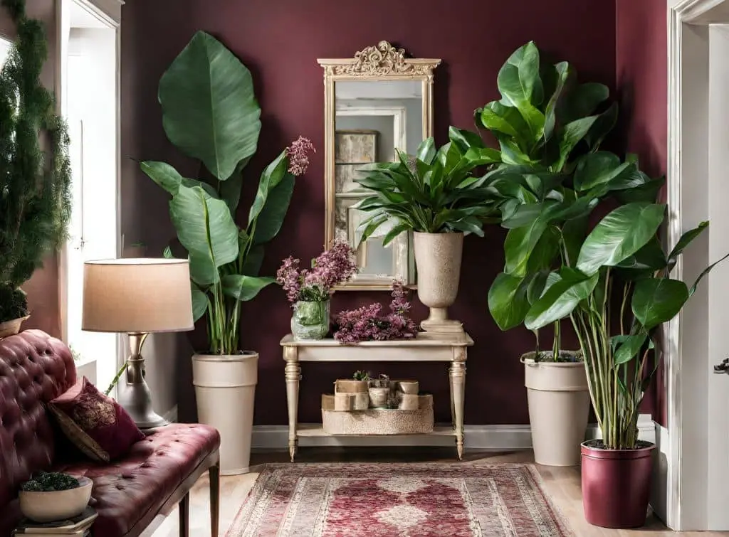
Large emerald houseplants placed near burgundy walls are a great way to make the most of this contrasting colour pairing. The vibrant green leaves stand out against the rich burgundy backdrop, combining the depth of red and nature's beauty for the perfect welcome home.
Forest green is forever luxurious
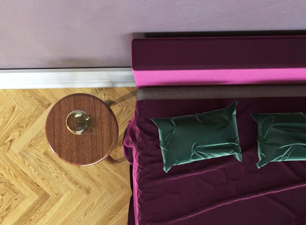
Forest green pillows strewn across a burgundy bedspread proves these colours are too posh to look messy. They create a striking balance of regality and interest sure to soothe you into a land of luxury. Choose materials such as silk or velvet to turn up the opulence.
Related content: Colourful kitchen ideas: Vibrant palettes full of personality.
See the tradespeople we've checked for your job
Analogous combinations
For those unfamiliar with the world of analogous colours, consider them colour neighbours. They sit next to each other on the colour wheel and create subtle yet harmonious shade symphonies when paired.
Burgundy's favourite neighbours are deep red and rich purple. Both of these colours create a soothing and cohesive atmosphere, much like the tranquillity of an English garden in autumn.
Deep red accents help burgundy make a statement
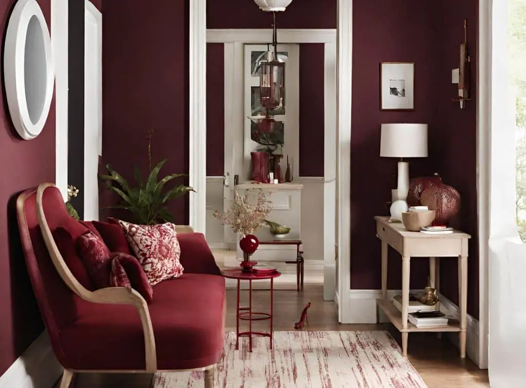
Accentuating burgundy walls with soft, deep red accents evokes roses in full bloom at dusk. Deep red is a subtle shift to the right from burgundy – which is the reason they work so well when used together.
Consider an ombre effect throughout your decor by introducing similar shades. This will maximise the impact while maintaining a sense of continuity in your colour scheme.
Rich purple walls are burgundy's perfect backdrop
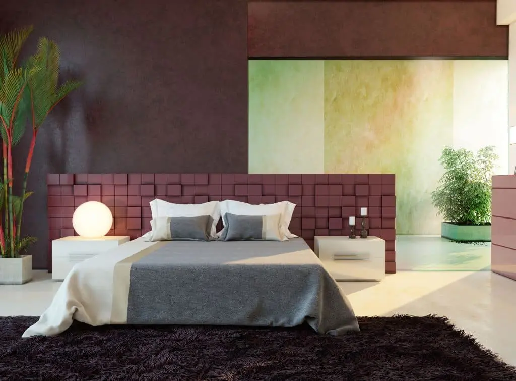
For the full royal experience, opt for a dark and moody bedroom design with deep purple walls, burgundy accents, and emerald plants.
It's a bold yet brave choice to incorporate so many analogous colours into your decor. However, by mixing up textures and patterns and introducing contrasting areas of separation (like the green area pictured), you'll start to embrace burgundy's versatility.
Top tip: Purple is a royal and serene colour – even more so than burgundy – so break up these rich shades with contrasting accents and neutral accessories.
Dusted burgundy creates texture and interest on colour-blocked walls
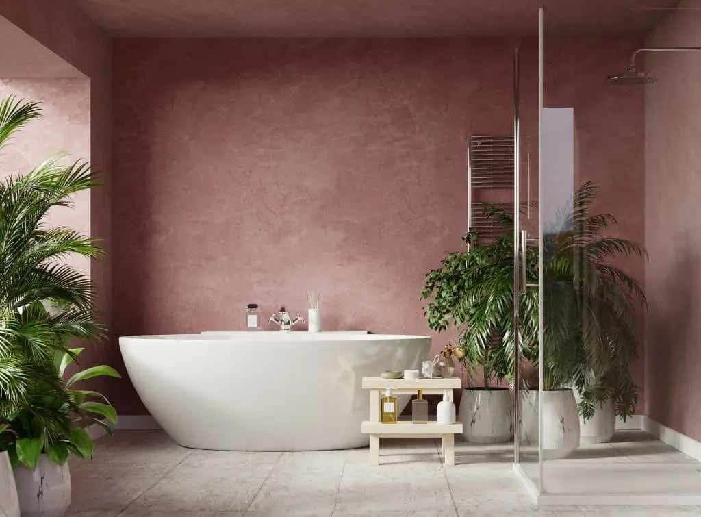
If you love burgundy but want to tone it down for bathrooms, utilities, or loft bedrooms, consider adding a dust wash effect. This creates a lighter and brighter atmosphere with a paint layer that mimics clouds and smoke.
Whether you opt for colour washing or choose to coat your walls with a whitewash finish, make sure you know how to do this before giving it a go. If in doubt, hire one of our trusted professionals.

On Checkatrade, you'll only find trades who meet our high standards and pass up to 12 checks.
Triadic colours
If you want to elevate your interior design to the level of an interior artiste, the triadic approach is a gem you need to mine asap.
Triadic colours are tricky to understand, but they're evenly spaced on the colour wheel and form a triangle when joined (like a dot-to-dot puzzle). On a primary and tertiary colour wheel, three colour groups sit between each triadic team.
For example, Burgundy's (Red Violet) tertiary pairings are Blue Green and Yellow Orange. Using these colours to guide our design examples, we added our favourite combinations below.
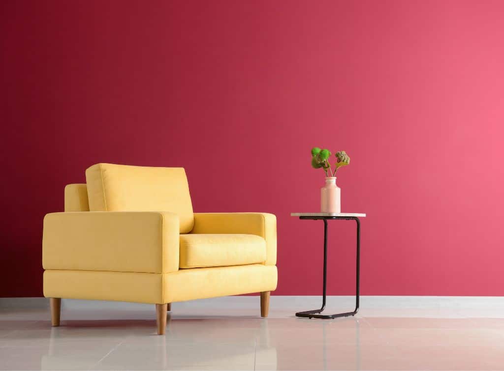
Mustard yellow brightens up burgundy's day
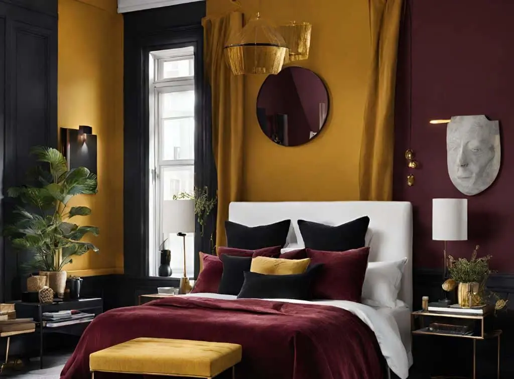
To complete the triadic trio, incorporate mustard yellow into your burgundy bedroom. Whether it's for feature walls, furniture, or accessories such as throws, artwork, or decorative vases, mustard brings the dawning sunshine into your space.
Keep your decor reminiscent of an autumnal day in the English countryside with neutral accessories or create cohesion and sophistication with black frames and contrasts.
Golden accents inject burgundy with undeniable opulence
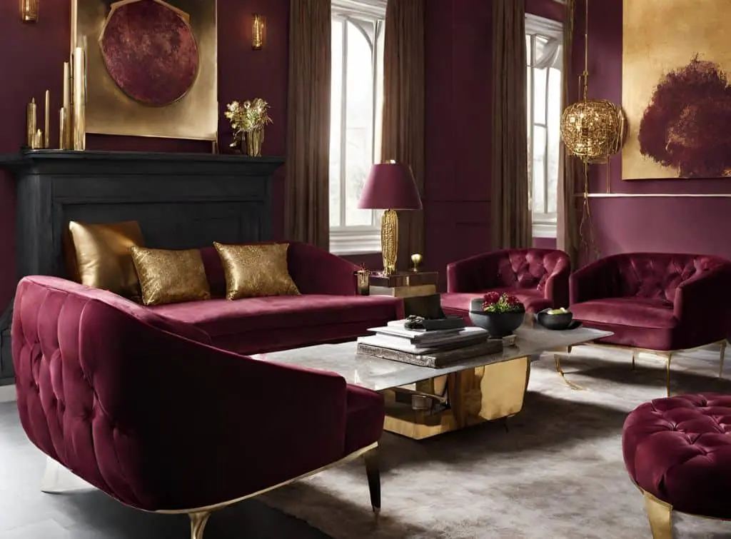
To further enhance burgundy's royal allure, consider incorporating golden accents like gilded frames, chandeliers, or ornate mirrors. These accents add a touch of opulence – perfect for burgundy-loving aristocrats. Now you just need a disgruntled butler and a Turkish Angora cat named Duchess to puuurfect the aesthetic!
See the tradespeople we've checked for your job
Burgundy and subtle neutrals
We've explored the magic of bold colour combinations. However, it's important to not forget the power of neutrals. For example, creamy whites, soft greys, and warm taupes are all supporting acts in your design story, each allowing burgundy to take centre stage.
Creamy white lifts burgundy's sultry mood
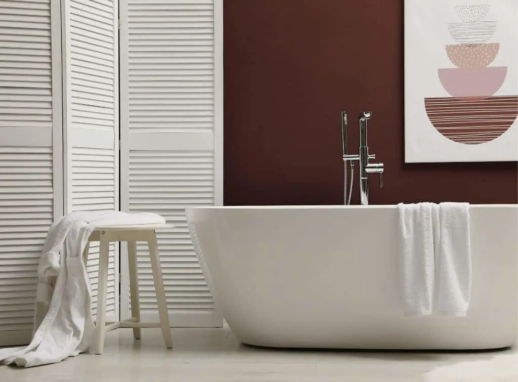
Whether it's a luxurious bathroom you're after or an afternoon tea dining experience (complete with burgundy furniture against the neutral backdrop of creamy white tablecloths and dishes), you can't go wrong with the lightest hue spectrum.
Creamy white creates an elegant contrast to the deep and sultry hue of burgundy, remaining refined, bright, and balanced all at once.
Medium woods are burgundy's timeless companions
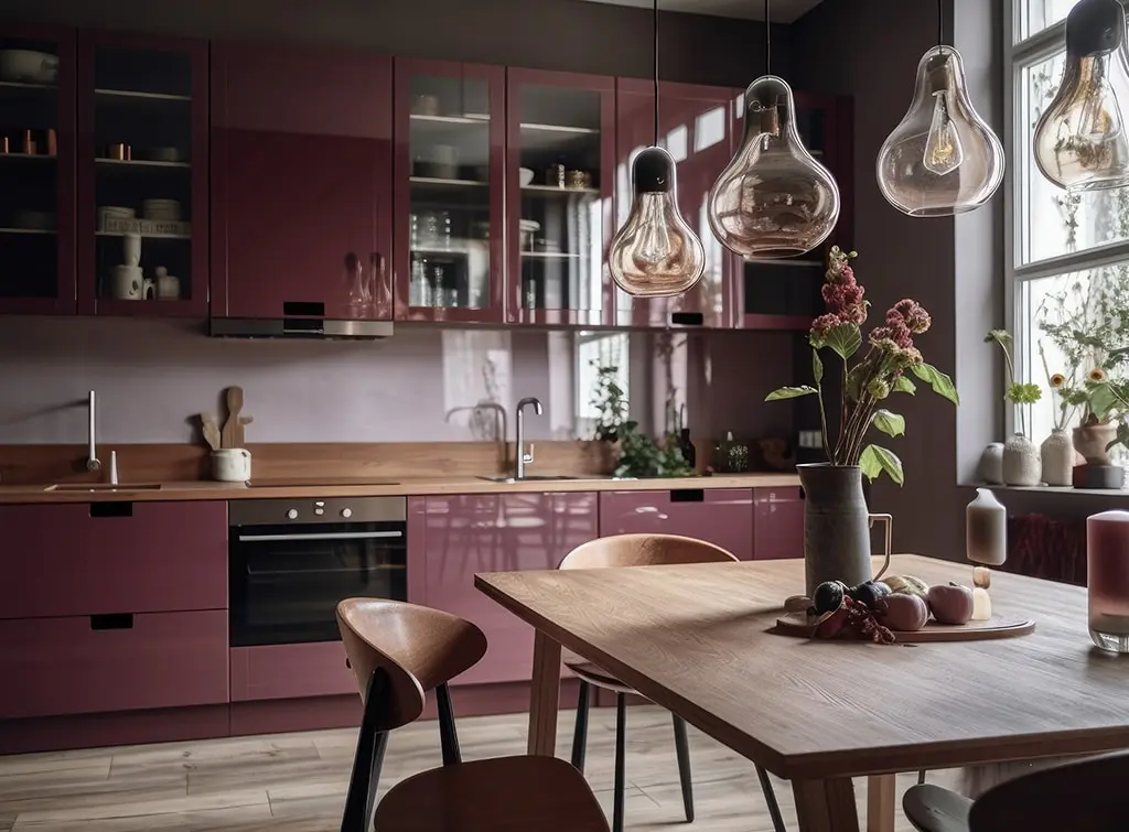
There's nothing homelier than a medium wood kitchen with burgundy cabinetry. It's a nod to cottage and farmhouse decor with the added sophistication and ambition of contemporary charm. Teak, elm, red cedar, and acacia all work well with the richness of burgundy, creating a warm and inviting space your friends and family will love to visit.
Did you find what you were looking for in this idea piece for What colour goes with burgundy? We hope so! Let us know in the comments or tag us in your renovation on Instagram. And for more ideas like this, check out our blog.
See the tradespeople we've checked for your job
More Painter / Decorator Articles


See the tradespeople we've checked for your job